How to avoid tapping the “Back” button in an interface design
"Back" button interaction is essential for navigation, but it can also become counter-intuitive.

UX Designer – Mobile Apps
As part of my daily UX job, I get to research a lot of mobile apps. Lately, I have been looking into different ways to move back one screen without having to tap on the “back” button. Simply put, see this interaction situation:
On iOS and Android, “back” interaction is generally placed in the top left area in the title bar (except for some cases on Android, which has a physical “back” button on the device).
Although this interaction is essential from a navigation perspective, it can also become counter-intuitive very quickly. This holds true for products where the main purpose is focused on browsing and exploring a wide range of content, for example, newspapers and e-commerce. Here are some reasons why this interaction can be counter-intuitive:
- Inconvenience of having to spot with your finger that specific location in the interface where the button is (this could get worse on tablets)
- Less immersive browsing experience caused by the repetitive “back” interaction
- Costly real estate in a small mobile interaction environment
Although we cannot completely avoid this interaction, I wanted to highlight some design alternatives that can prevent this from being systematically present.
Provide hidden yet powerful gestures
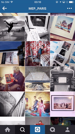
There are already smart gestures supported by a system’s OS for quicker navigation to the previous screen. For example, on iOS, users can swipe-back and quickly jump to main page via double tap on the menu tab bar.
Just like in Instagram’s example, you can take advantage of existing system interaction tricks: Swipe-back to the previous screen. This is a simple solution to handle “back” interaction without going too crazy with the interface architecture.
Guardian
Swiping down or swiping up to move back one screen is also becoming pretty common. You’re also seeing a lot of this in apps like Pinterest, whose purpose is to explore visual content.
Rethink the whole UI architecture
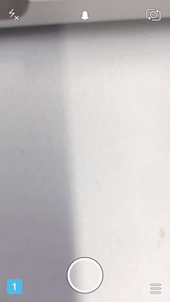
Snapchat
Snapchat doesn’t have any navigation bar. Everything is accessible using gestures. Swiping top > down to access your user profile. Swiping left > right to access the camera. Swiping right > left to access different media content and so on.
Nike
Just like Snapchat, Nike Tech Book rethought the whole structure of the application in such way that a permanent navigation bar on the bottom was removed completely. Everything else is accessible via gestures from top down to left right and vice versa.
Provide additional access
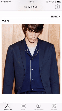
Zara
Zara provides additional access for navigation between clothing categories by just dragging down the catalog. You don’t have to go back systematically to the complete list of categories in order to change the category you’re navigating.
Zalando
In a similar way, you can consider vertical navigation from one product to another by swiping right <> left from one product detail to the next. This way, you don’t have to go back to the catalog list which features all products.

Play with transition or position
This example provides the “back” button on the bottom where the navigation bar is. All functional buttons are also on the bottom, allowing users to focus on consuming the content starting from the top.
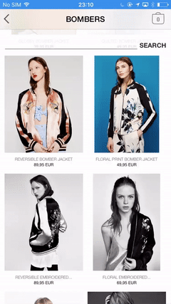
Zara
With a nice transition effect, you can remove the feeling of going to a deeper level in an interaction with the use of a different icon. For example, “close” instead of “back”.
In conclusion, each alternative has its pros and cons. It can work individually or in combination with other methods for a more convenient and frictionless navigation experience. It is important to choose the method that makes the most sense in your design and in the experience you wish to deliver via your app.
What do you think? How do you handle “back” interaction in your UI? Let me know via Twitter @clemhee.
We're hiring! Do you like working in an ever evolving organization such as Zalando? Consider joining our teams as a Frontend Engineer!


